The interior design of your book is important as much as the design of the book’s exterior. The front/back/side cover, the inserts, sentence structure, trims, margins, fonts, spacing needs your attention. We go over what is important for your books interior design to give the reader a good reading experience.
When the reader notices a book in the bookstore and opens it to explore the content, a first impression on the book’s layout is vital in buying decision. A well-designed interior structure/content puts authors one step ahead as an integral part of marketing.
The self-publisher can either design their book themselves or have a graphic designer do it. Regardless of who do takes care of design, it is important for you as an author to know basics about boos interior design.
As a writer, you probably have an rough idea on how you want your finished book to look like – if you decide to hand over this job to a graphic designer, you must convey your expectations to get there.

WHAT DOES A PROFESSIONAL PHRASE MEAN?
A professional phrase creates a uniform and high-quality look for the book. It gives the reader a readable text as well as a good reading experience. The uniform appearance of the insert and the high-quality phrase is based on a comfortable and easy to read font, suitable font size, and correct spacing.
The purpose of the sentence is to create both a consistent and high-quality look on the book. It gives the reader an idea of the quality of the book and facilitates the purchase decision. A good sentence means that the reader does not have to think about the sentence; the good readability means that you focus on the content rather than the sentence.
Furthermore, a professional phrase contains appropriate font and heading style, correct text size, and proper line spacing and margins. The same goes for image placement; it is good to keep the distance to the text uniform throughout the book. The chapter breakdown and the text surface positioning also belong to the sentence: a uniform paragraph breakdown and style make the story flow clearly.
HOW IS THE SENTENCE PLANNED?
The starting point for the design is the text, the book’s title, and target group, i.e., who the book is intended for.
There are no set rules that every author should follow when writing. There are many options to choose from, and using your own ideas and own creativity is ok. Using your own design style can even be an advantage as long as you have a design style. However, most sentence types have typical features and elements that facilitate the reading experience, and that should be taken into account in advance.
You can start planning the sentence by thinking about what the cover of the book communicates to the reader, and you can think about how the content should look. For example, a reader who reads a novel expects a specific text size and style, no uppercase letters and images – while a reader who becomes interested in a specialist book will likely be convinced by the factual information in the book as well as a professional look. The style of the sentence is thus strongly influenced by the genre and the target group, i.e., who the content of the book is aimed at.
A practical tip is to review other books from the same genre when you set your sentences. Visit a bookstore for this or look through your own bookshelf. Review, research, compare with other books and think about what elements you can use in your book’s setting. Also, consider which book you think is clear and easy to read and then use the same style for your book.
SENTENCE TYPE AND FONT
The genre of the book determines the style and the final look. When planning the sentence, inspiration, and ideas based on the manuscript are needed – in connection with this, it can be useful to compare with other books in the same subject or genre. When deciding on the type of sentence to use, there are usually many alternatives – however, the genre of the book is crucial.
BODY TEXT
The most common fonts used for fiction are serifs – this is because of their readability. The heels (the hyphens that end the letter stack that is a letter or character) seem to direct the eye from letter to letter and word to word.
Fiction books are usually read for a long time, and therefore, both font and layout should be as clear and easy to read as possible. Novels often use fonts such as Minion, Garamond, or Athelas. When it comes to the size of the font, small (10-11 points), too narrow line spacing should be avoided.
In poetry books, the pages are divided according to the position of the poems. It is recommended to choose the same font for the entire sentence, but depending on the style of poetry, the sentence may also be artistic or playful.
Reading non-fiction books differs from reading fiction books in that the reader often searches for specific passages in the text based on the information they are looking for. Important information in the text can be characterized by, e.g., bold or italic style.
Therefore, antiquate fonts are common in professional literature as well. Unlike fiction books, both antiquate fonts such as Myriad Pro, or Proxima Nova and serif fonts can be used. The size of the font is usually 8 to 11 points. The style of the sentence should fit the contents of the book, and the style is therefore factual.
Books for children and older people often use a larger font size and especially for books aimed at young children, the content consists mainly of images. The font is playful, such as Swinging Petidoni.
Margins and other empty spaces around the text also part of the book’s style. For example, in poetry books, space gives room for the reader’s interpretation, while empty spaces in professional books have a different meaning.
The inner and outer margins should be wide enough, especially in novels, so that the reader can hold the book “normally” without covering the text with their fingers. If you use narrow margins, the text gives a messy impression and makes it look crowded. When you decide on the margin width, you can compare with other books that you read comfortably.
HEADINGS AND CHAPTERS
The heading structure consistently divides the content of the text into sections and creates an organized feeling. The heading hierarchies reproduce the content and make the text interesting and easy to see through.
In a few books, the text goes from cover to cover without any sort of division. Both fiction and non-fiction books contain chapters whose task is to divide the text into clear sections and help the reader understand the content.
In fiction books, for example, a new chapter can be started when the narrator, place, or time is changed, or the author begins a new chapter to create tension in the story. A new chapter is always started on a new page, and the text can be started directly as a body text.
Another alternative is to start the text in the new chapter with a so-called capitalization, where the first letter, first sentence, or first words of the new chapter have a larger font size or even capital letters.
Non-fiction books usually contain both headings and sub-headings that make the text organized and make it easier for the reader to find the desired information. If the book includes subtitles, you should avoid using too many different fonts – this often means that the whole text gives a messy impression.
In fiction books, the headings may contain decorative elements such as symbols or other ornamental features. The headings must be uniform and precise: they should be placed at the beginning of each paragraph, with or without numbering. Headings do not have to be named but can also consist of a number, or the heading can be omitted entirely.
In fiction books, the purpose of the paragraph division is primarily to divide the text into consecutive sections to ensure readability. Headings in non-fiction books, on the other hand, help the reader find the right information. It is therefore recommended to add headings, especially in non-fiction books.
AN IMAGE IS WORTH A THOUSAND WORDS
Images create interest, support the text, and give the text an added value and/or information.
The images give the text of the book more life, and they serve as a visual complement. If it is not a picture book, the images are intended to support the message in the text or emphasize the importance of a particular text.
In non-fiction books or manuals, images are often used to illustrate and clarify the text’s content and give different examples in the form of photographs and figures. In children’s books, images are an essential part of the story that reflects the children’s book content. The pictures are usually drawn or painted in children’s books. In historical works such as biographies or history books, images enrich the content of the text and allow the reader to gain insight of the past.
If the images intended for the book are of poor quality, it is better to omit them altogether. Blurry images give the book an unprofessional impression, and, as previously mentioned, the purpose of the pictures is to support the story – poor quality pictures affect the opposite. Old black and white images may not look clear even with the best software. As a professional writer, you want to show that you are an expert in the field, and good quality pictures emphasize this.
The placement of the images is also prominent in connection with the setting. In children’s books, the images are usually large and clear, and they often cover a whole page. In professional books, large images are rarely used; instead, images are used as smaller sizes that support the text. Alternatively, you can insert a kind of picture gallery in the middle of the book in non-fiction books. Regardless of where you place the images, there should always be a clear caption for them.
TITLE PAGES AND TABLE OF CONTENTS
The book’s initial pages, i.e., the title pages, should always follow the same pattern in professionally created books. You can choose any book in your bookshelf, and you will notice that the body text never starts on the first page of the book. The title pages are unnumbered and contain the author’s name and the title, as well as an imprint page with impressum providing copyright, ISBN, and print and publishing information. The page numbering starts from the page where the body text starts.
If the book is to have a table of contents, it is usually created immediately after the print site page. The table of contents lists all the book’s main chapters, sometimes also sub-chapters – these help the reader navigate the book.
For this reason, a table of contents is important, especially in professional books. In novels, a table of contents is unnecessary, but it obviously helps the reader find the right chapter, right at the beginning of the book. The actual body text starts on the first odd page – to the right – after the table of contents.
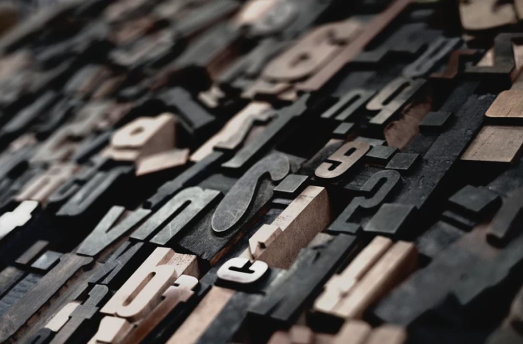
HOW IS THE SENTENCE MADE?
The writing of the manuscript can be done with a professional phrase software or – if you are looking for a free version – in a regular word-processing program (e.g., word). Grammarly is highly recommended here, even its free version helps a lot.
The design software used by most graphic designers is Adobe InDesign – a program suitable for placing images and text professionally. Before each sentence, the text and font settings that you will use throughout the sentence are defined – this gives the book’s layout a consistent look. It is possible to make certain presets in word as well, but the most significant work must still be done manually in word processing software.
CHECKLIST FOR BOOK INTERIOR DESIGN
- Choose a suitable font, the right text size, and the correct word and line spacing for your book theme. Find inspiration by browsing other books of the same genre
- Choose the font and text size for the headers and set the subheadings’ size to be slightly smaller than the main headers
- Set the margins on both sides of the body text (Note that the text should be marginally adjusted, like having straight right and left edges)
- Add title pages to your book: author name, book title, impression, and any dedication
- Check the quality of your pictures and adjust if necessary. Plan where in the text the images should be placed and ensure that the images get a consistent layout
- Finally, update the table of contents and verify that the page numbering is correct
Kind regards, Melissa Mayer


